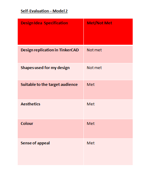
Statement of Inquiry:
Data storage has evolved through technological advances in the medium of storage devices
Introduction:
A storage device is a piece of computer equipment where information can be kept and stored. There are two types of storage devices - a primary storage like RAM and a secondary storage like a hard drive. They can be stored outside the CPU - Central Processing Unit (external) or stored inside the CPU (internal). Storage devices are also referred to as digital storage, storage media and storage medium. The storage devices are an essential part of the computer and without them the computer wouldn't be able to save any settings and information. Secondary storage devices usually have a large storage capacity and they store data permanently. Examples of secondary storage devices include disk drive and USB storage drive. Storage devices can store information both permanently or temporarily. Primary storage devices are generally small and made to hold data temporarily and are internal in the computer, they have the fastest data speed access. However secondary storage devices have a larger storage capacity and store data permanently and they are both internally and externally.
Task: Creating a booklet for Storage devices
Target Audience: Year 7 students
Global Context
During this topic I will be using the skills of researching to find out information about storage devices for the booklet I will be creating as my project for the year 7s this term. The main research engine which I will be using is Google and basically going from site to site to find out information. I will be trying to avoid Wikipedia and only using trustworthy sites such as BBC bite size. Since this is aimed for year 7s, I will write my information in simple English and in bullet points so the information can be easily understood and it’s not boring for them to read. Also i will try and use some books from the school library, simply to check if the information on the internet is correct. To display my booklet, I will be using the internet to find out ideas such as models etc. so the year 7s will be interested in reading the booklet and it won’t just seem like a boring book.
Communication
To display my information, I will be creating a model so the
students of year 7 will be fascinated by it and will want to read my booklet.
Another ‘tactic’ that will enable the students of year 7 to understand devices is
by adding a lot of pictures to make it look like there is less writing and more
images. In addition I will be using bright and vibrant colors such as reds and
yellows; I will try and stay away from blacks and greys. I will use bullet
points to display my information and will keep it concise and clear and easy to
understand for year 7s. The type of font that I will use will be bold and big,
easily read and a fun and bubbly font – not cursive or writing that can’t be
understood.
Fairness and Development
This term I will be creating a booklet about storage devices
which is aimed to teach year 7s about this topic. I will be sharing resources
and ideas with them so they can learn about this topic and use it in the future
when they are in IT class or even in other classes. I, as a year 8 student,
have the responsibility of creating a booklet which is targeted for year 7s,
easy to read and understand, visually appealing and not too boring, full of
images and pictures which suite the topic. My aim is to help the year 7s
understand what storage devices are and teach them about certain ones, while
still having fun at the same time.
Cover Page Design Sketch 1
Fairness and Development
This term I will be creating a booklet about storage devices
which is aimed to teach year 7s about this topic. I will be sharing resources
and ideas with them so they can learn about this topic and use it in the future
when they are in IT class or even in other classes. I, as a year 8 student,
have the responsibility of creating a booklet which is targeted for year 7s,
easy to read and understand, visually appealing and not too boring, full of
images and pictures which suite the topic. My aim is to help the year 7s
understand what storage devices are and teach them about certain ones, while
still having fun at the same time.

Cover Page Design Sketch 1

Reflection & Justification of Chosen Cover Page Design
During this week in IT class, the task was to plan and sketch 2 different cover pages for a booklet about storage devices. I did not find this task hard especially because it was very easy to create, the only thing I didn't really enjoy was the drawing part because I'm not a very good drawer/ artist so I was tracing off the computer however sometimes the computer would close the screen and become black and so it would mess up the design and I would have to start again. I used very bright colors so the designs would stand out and made it look informal to suit the target audience which is Year 7 students. After I had sketched out the designs for both cover pages I took a picture of both of them, I saved them on Microsoft Word and annotated each design (what image I chose, why I chose that color, what font I chose and why etc). Overall, I think that both designs are suitable to the target audience which are Year 7's and both of them are neat, tidy and clear to look at; there isn't to much going on.
Design 1
Design 1 uses colors related to IT such as blue and greys but still a pop of color of red which in my opinion makes it attractive. The clip art computer makes it suitable to the target audience because it is funny and will interest the students because it's not boring and formal. Also I incorporated a heart which is an emoji and a mouse which is related to IT. The font is bold and big enough to see and the use of the color red attracts the students.
Design 2
Design 2 has a really bold picture of a USB which is a storage device, and mouse clicks which represent IT. To suit the target audience and not make it too formal, I added a picture of pacman which all children know. The title again is very bold and big - very easy to read and attracts people because of the use of the color blue - bright and happy.
Justification
The final design which I have chosen is design 2 because it suits more the target audience and it's more visually appealing. The funny clip art of the computer which has eyes and a mouth is supposed to attract the younger audience. Also the mouse and the wired shaped like a heart shows that IT is fun and amazing which will encourage students to learn about Storage Devices. I am planning to change the color scheme because red doesn't really fit the topic and I will probably use blue instead because it resembles computers and technology in general.


Design 1
Design 1 uses colors related to IT such as blue and greys but still a pop of color of red which in my opinion makes it attractive. The clip art computer makes it suitable to the target audience because it is funny and will interest the students because it's not boring and formal. Also I incorporated a heart which is an emoji and a mouse which is related to IT. The font is bold and big enough to see and the use of the color red attracts the students.
Design 2
Design 2 has a really bold picture of a USB which is a storage device, and mouse clicks which represent IT. To suit the target audience and not make it too formal, I added a picture of pacman which all children know. The title again is very bold and big - very easy to read and attracts people because of the use of the color blue - bright and happy.
Justification
The final design which I have chosen is design 2 because it suits more the target audience and it's more visually appealing. The funny clip art of the computer which has eyes and a mouth is supposed to attract the younger audience. Also the mouse and the wired shaped like a heart shows that IT is fun and amazing which will encourage students to learn about Storage Devices. I am planning to change the color scheme because red doesn't really fit the topic and I will probably use blue instead because it resembles computers and technology in general.
Inner Page Design Sketch 1
Inner Page Design Sketch 2
Reflection & Justification of Chosen Inner Page Design
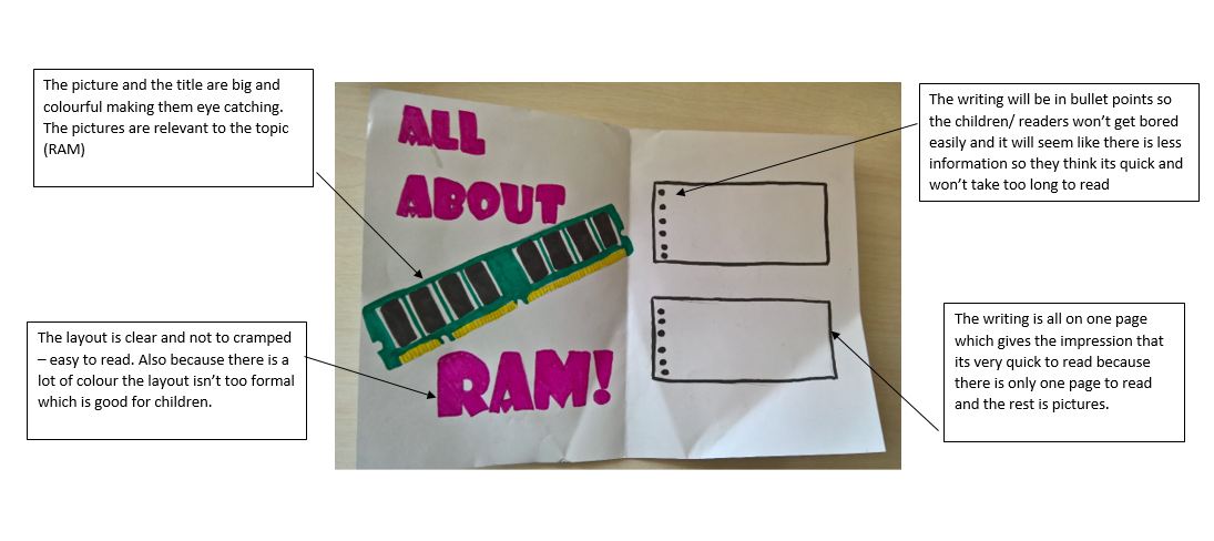
This week we had to design our inner pages for our booklet. They both were based around the same idea of having text boxes and bullet points to minimize the amount of writing. This task was much easier than the previous task of the front cover because there wasn't as much drawing and coloring as there was before and I'm not a fan of art like drawing and coloring. Like the cover pages I didn't really enjoy this task because it included drawing and as I said before I'm certainly not the best artist. However I used the computer screen again and I managed to complete the task on time. I drew very bold and big pictures and used bright colors to attract the younger audience and make it seem like the booklet wasn't just writing.
Design 1
In Design 1 each page has a text box with bullet points and either the title (left) and the picture (right). By using this format, it gives an effect of a balance between writing and pictures. Also the size of the text box is the same as the size of the picture so there isn't more writing (makes it less boring and more interesting). The click on the mouse makes it look funny and interesting - as if you were clicking on a website or a name to find out more information.
Design 2
In Design 2 the two pages are split in two - one dedicated for the writing and one dedicated for the picture. The title of the page is bold and bright and uses a font which is very easy to read. The page is not cramped and the picture is big and is the main highlight of the page. The second part of the inner page was dedicated to the writing. The writing is laid out in text boxes and I used bullet points so it is much easier to read and isn't boring to actually look at.
Justification
I have decided to choose Design 1 because it is the one that looks best and the one which I think would attract the target audience (Year 7). In my opinion the click really adds the finishing touches and simply look really good. Also there is very nice balance between the writing and the pictures. Also by having half writing and half pictures will help me to not write so much and keep the booklet fitted for year 7.
Final Front Cover Design for Storage Devices - Publisher
Reflection
This lesson we were given the task to create the cover page of the storage devices booklet using Microsoft Publisher. As you can see from the picture above I didn't just stick to one design like I said I would on the previous page. I used both sketches and mixed ideas to create a totally new front cover, on top of that I also used other patterns which I had not added to my sketches but thought it would look really nice and finish the design off really well. I still used the same font but had to adjust the font size so the writing would fit on the page because the font I wrote on my sketch was way too big. I also chose to have a border on the two bottom corners of the front page - the borders had a keyboard pattern which was really nice and since it was white it was very subtle and didn't 'hide' the main picture which is the computer. Something else that I included in my final front cover was the background color. I felt like the light blue as a background would really fit with the whole color theme and the pictures as well which also fitted the color theme (blue and white). Mentioning the color - the font color is also a light blue but a little darker than the background. I still kept the mouse clicks because I really liked them, but instead of adding four (one on each corner), I decided to insert only two, on the top corners of the page. I enjoyed this task more because it simply involved finding pictures on the internet and choosing the color scheme, whereas on the tasks before I didn't really enjoy them because we had to draw. When doing this task, I was deciding between having a border or not and I tried adding different types of borders but non of them suited the front page so I decided to keep the front page without a border. After completing this task, I'm really excited to create my whole booklet and display it.


First Inside Page
Second Inside Page
Third Inside Page
Fourth Inside Page
Reference Page

Final Product with Model


Criteria D - Evaluating
Arnima - Peer Evaluation

Aria - Peer Evaluation

Final Reflection
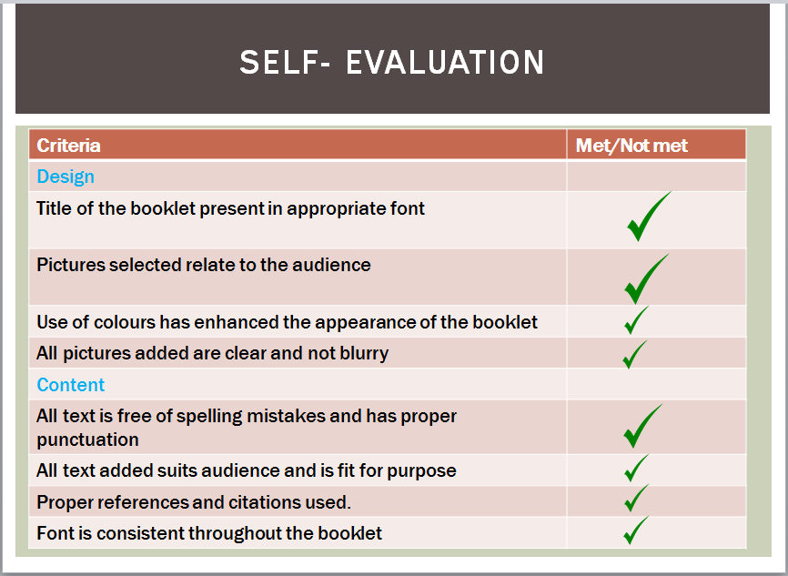
This lesson, was the last lesson I spent on my booklet on storage devices and this lesson Aria and Arnima completed my Peer Evaluation grading my booklet. I must say that I got very positive comments from my peers as both Aria and Arnima awarded me with full marks for the following subjects: Graphics, Content Accuracy, Attractiveness, Mechanics/grammar, Organisation, Ideas and References. This task was my favorite task this year, I preferred this than any other task we have done this year (Tinker CAD and Tech Fair) because I discovered and improved my skills using Publisher. Regarding the booklet, I decided to add a sort of border on the corners of each page because I thought it made the booklet more attractive and visually appealing. Also I used good quality pictures and decent amount of writing; I had a good balance between images and text. To complete my booklet and make it even more suitable for the target audience, I decided to display my booklet on a model. The model was supposed to represent an Apple MAC computer. I chose a MAC because a lot of the younger generation knows the symbol of Apple and knows what a MAC looks like, instead of displaying it on a storage device which may not be in their interest. I must say that during this term, I had a very positive attitude towards this project and was always hitting deadlines so my work did not fall behind. I completed my model and the booklet before the deadline so I had time to improve them both, if I needed to but fortunately everything was okay and Ms. Veena even asked me to present to the class as well as 8BB (the other IT class), by doing this, I got a little bit of practice before I will present my project to them next week. I also improved my skill in referencing because this time instead of using an online generator, I typed the references by hand and it turned out that it was actually must faster typing them by hand than finding the generator and filling in the information before it actually gives you the website properly referenced. During the creation of the project, I also used something that I had never taken into consideration using before in IT which was an action plan. Using an action plan made my life so much easier when creating the booklet and the model because I was able to constantly see what I had done and what I still had to do. This helped me not fall behind during lessons/ after lessons so all my work was completed. However, I did fall behind once and it was because I hadn't completed my reflections on time. If I were to do this project again, I would certainly do longer and more detailed reflections because I feel like this term I didn't really put in as much effort with my reflections as I had previously done for other projects. Also I would add more pictures instead of more writing because, in my opinion pictures in some cases can explain something better rather than a paragraph of rubbish. Coming to an end to my reflection, I must say that I am very proud of the work that I have produced this term and the way that the booklet and model came out to be. This year I can say that I have put in a lot of effort and challenged myself more than I ever did in ICT class and thanks to Ms Veena, not only will the year 7s be learning something new and expand their knowledge on IT and storage devices but I have done a lot during this project. I now know a few things about IT which I had no clue about before. I am looking forward to next year and the next years project.
Final Product with Model


Criteria D - Evaluating
Arnima - Peer Evaluation
Aria - Peer Evaluation
Final Reflection
This lesson, was the last lesson I spent on my booklet on storage devices and this lesson Aria and Arnima completed my Peer Evaluation grading my booklet. I must say that I got very positive comments from my peers as both Aria and Arnima awarded me with full marks for the following subjects: Graphics, Content Accuracy, Attractiveness, Mechanics/grammar, Organisation, Ideas and References. This task was my favorite task this year, I preferred this than any other task we have done this year (Tinker CAD and Tech Fair) because I discovered and improved my skills using Publisher. Regarding the booklet, I decided to add a sort of border on the corners of each page because I thought it made the booklet more attractive and visually appealing. Also I used good quality pictures and decent amount of writing; I had a good balance between images and text. To complete my booklet and make it even more suitable for the target audience, I decided to display my booklet on a model. The model was supposed to represent an Apple MAC computer. I chose a MAC because a lot of the younger generation knows the symbol of Apple and knows what a MAC looks like, instead of displaying it on a storage device which may not be in their interest. I must say that during this term, I had a very positive attitude towards this project and was always hitting deadlines so my work did not fall behind. I completed my model and the booklet before the deadline so I had time to improve them both, if I needed to but fortunately everything was okay and Ms. Veena even asked me to present to the class as well as 8BB (the other IT class), by doing this, I got a little bit of practice before I will present my project to them next week. I also improved my skill in referencing because this time instead of using an online generator, I typed the references by hand and it turned out that it was actually must faster typing them by hand than finding the generator and filling in the information before it actually gives you the website properly referenced. During the creation of the project, I also used something that I had never taken into consideration using before in IT which was an action plan. Using an action plan made my life so much easier when creating the booklet and the model because I was able to constantly see what I had done and what I still had to do. This helped me not fall behind during lessons/ after lessons so all my work was completed. However, I did fall behind once and it was because I hadn't completed my reflections on time. If I were to do this project again, I would certainly do longer and more detailed reflections because I feel like this term I didn't really put in as much effort with my reflections as I had previously done for other projects. Also I would add more pictures instead of more writing because, in my opinion pictures in some cases can explain something better rather than a paragraph of rubbish. Coming to an end to my reflection, I must say that I am very proud of the work that I have produced this term and the way that the booklet and model came out to be. This year I can say that I have put in a lot of effort and challenged myself more than I ever did in ICT class and thanks to Ms Veena, not only will the year 7s be learning something new and expand their knowledge on IT and storage devices but I have done a lot during this project. I now know a few things about IT which I had no clue about before. I am looking forward to next year and the next years project.